Client: Pernod Ricard India
Project: Blenders Pride Packaging Redesign
Blenders Pride is a blend of Scotch malts and Indian grain spirits. Originally launched in 1995 by Seagram, the brand became part of Pernod Ricard India’s (PRI) portfolio when Seagram’s Indian operation was sold to Pernod Ricard in 2001. The brand appeared at number six in The Spirits Business’s list of the top ten best-selling Indian whiskies in 2022.
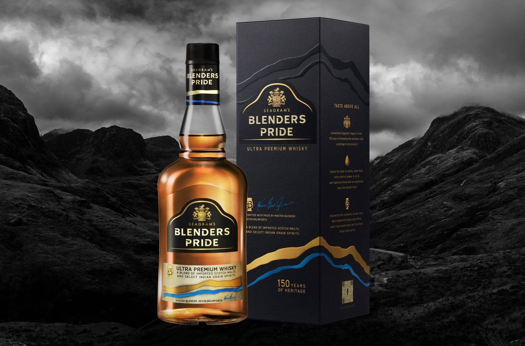
Our new design preserves three core features of the previous packaging: the Seagram’s crest a badge of quality in India), the bell-shaped gold highlight and label shape, and the overall black colour. The Blenders Pride wordmarque was developed to give it more modernity and distinctiveness. Cuts to the ‘B’, ‘D’ and ‘P’ signify the selection of the best cuts by the master blender Keven Balmforth.
The wordmarque’s gold underlining has been thinned and shaped to make it more premium and refined.
Two new assets were developed to not only address the two primary objectives but give the Brand Team more to work with off pack in promotional materials. First, two rivers have been introduced, which are reproduced in gold and blue, and as a gloss varnish on the satin-finished mono-carton. The rivers signify the confluence of two cultures and two whisky making traditions that comprise the blend. The blue river represents Scotland and the gold India.
Secondly, a glass-shaped signifier was created, as an encapsulation of the skills and craftsmanship of the master blender. The intertwined ‘B’ and ‘P’ represent the artful blend of Scotch malt whiskies and Indian grain spirits - the intertwining of two types of liquid. The signifier appears on both the mono-carton and front foot label, and also embedded in a QR code.
To convey modernity, we gave core pack information - such as Kevin Balmforth’s signature, the blend description and 150 years of heritage message - an asymmetrical layout, with text left and right aligned.
Our brief had three core objectives. First to attract new consumers while retaining existing ones. Secondly, to address negative perceptions of the brand; in particular, its insufficient modernity and lack of relevance to younger consumers’ lifestyles and aspirations. Thirdly, to reassert its market leadership through superior packaging, rich in overt premium cues and design detailing. Given the value of the brand, a key consideration of the redesign was contemporising the packaging’s look while maintaining a continuity with Blenders Pride’s core visual assets. The Brand Team was keen to signal a noticeable change but not at the expense of accrued visual equity. In other words, they were keen to not “throw the baby out with the bathwater”.
Another important design consideration was PRI’s decision in 2022 to phase out permanent mono-cartons across its portfolio of brands. The initiative, aligned to its Sustainability & Responsibility roadmap, aimed to remove 500 million pieces of mono-carton annually. This meant that for the first few months of the relaunch the brand would benefit from an enhanced mono-carton with developed reasons to buy but thereafter, when the mono-carton was dropped, the bottle, labels and cap would have to do the ‘heavy lifting’.


